Mobile first is a modern concept of designing a website using mobile devices as your first concern.
Why should we need to be worried about it?
According to the website statista.com in 2020 the world has 3.5 billion smartphone users as well as today an estimate calculate that PC users are less than a half of it in addition desktop devices are more useful for working purposes.
In other words nowadays the number of smartphones is tremendously bigger than desktop devices worldwide, therefore we should reasonably conclude what is the best idea to our project: Mobile or desktop first?
Mobile first concept was developed by Luke Wroblewski he is Google’s director of products as well as wrote a book called “Mobile first, web from design and site seeing.”
Mobile devices currently have an enormous number of features like: High-resolution cameras, GPS, touch screens as amongst others, furthermore utilizing those resources to improve the user experience not only by developing a responsive website although an amazing interface to people.
Sometimes merely adapt a desktop website to a responsive design, could be tough as well as trick in reason that it is not only a screen size matter, it is critical to ensure that all information are highlighted in addition easily understandable, we should, moreover, be aware that normally mobile internet services are not that good and could be slow sometimes the developers must need to reduce the amount of detail loading it rapidly.
Another key issue will be the images we can not solely reduce an image with a considerable width to fit correctly in a small screen resolution because this content could lose its meaning, therefore the solution might be to modify or remove that image.
Let’s imagine the following scenario. You bought a ticket for a music festival by utilizing the desktop version of the website, however you are on your way to the event nevertheless you want to confirm what time your favorite band will start the concert.
The desktop version is showing all artists, setlists, bios, curiosities, etc., in reason that big screens permit it, although small devices must need to show solely essential information at the first glance, by doing it the users will undoubtedly find what they desire quickly, so the time that the presentation will start should be the first information when we are talking about responsive design in that case.
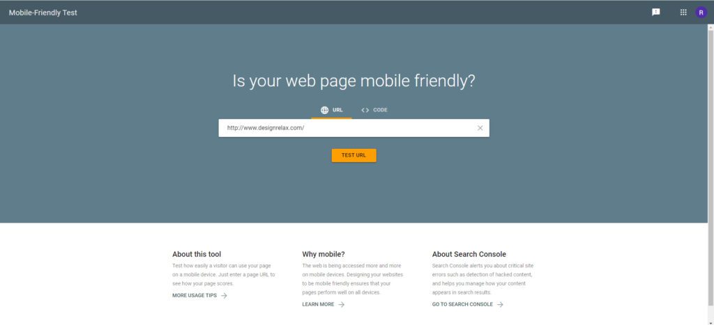
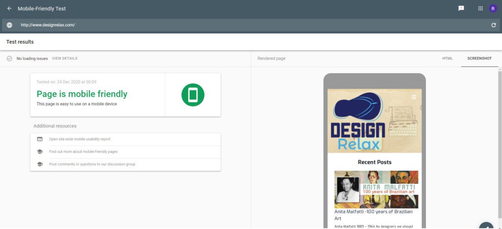
A very useful tool to test your responsive design is https://search.google.com/test/mobile-friendly
There you can realize if your design is working good for small devices and have a nice check on your code.
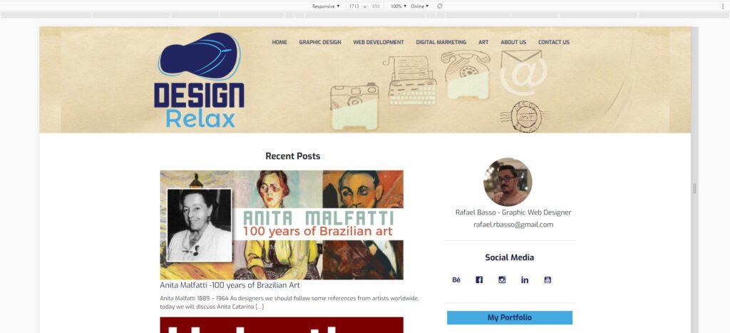
We can use Google Dev Tools to identify how our pages are behaving properly on different screen sizes and devices by inspecting the code. (Right click on any area of the page or press F12 on the keyboard.)
Therefore, we should thoroughly study what kind of method we will employ to prevent a waste of time and consequently money.
Keep an eye on the subsequent posts in order that we are preparing an article regarding desktop first advantages as well.
Wrote by Rafael de Rezende Basso

