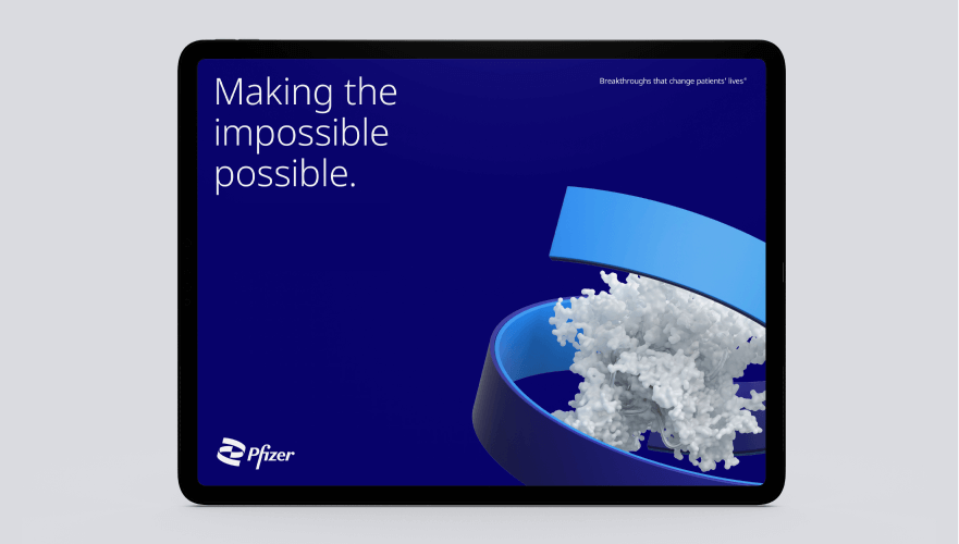
Pfizer is one of the companies that was injecting in us a shot filled with hope, however, the company is marking this hard time with a rebranding to generate a “new era” of science and research.

Pfizer was founded by Charles Pfizer and Charles Erhart (both German descendants) to supply penicillin during war times.

The communication was developed by the American agency Team. It was 18 months of work. The brilliant idea was to create a new era in science, according to Albert Bourla (Pfizer’s CEO) “Pfizer is no longer in the business of just treating diseases – we are curing and preventing them.” he says.

A recent survey properly indicates the company’s excellent reputation grew 48% among Americans, of course, ramped up by the effective COVID-19 vaccine.
The icon is inspired by the DNA shape, in addition, the brand consists of a direct connection between science and commerce, the rounded form reveals it with perfection.

If we carefully analyze colors’ psychology, blue is easy to apply by all means in science and technology fields as well as it demonstrates the seriousness of the company.
The “Helix” is the most drastic change. The key concept to create it was bringing all together promoting a direct reference to a new circle of life.

The modern typeface is also new according to the agency. Noto Sans is a font designed for tomorrow, and it is also contemporary and global.
Noto Sans was developed by Google.
Coming to an end this rebrand, for now, could represent the most exciting visual identity developed this year as all the markets are holding on budget at this moment.

Did you like the logo? Tell us in the comments.
Wrote by: Rafael de Rezende Basso


