The Tokyo 2020 games are about to start and now everybody is feeling the Olympic spirit, at least it will divide people’s attention with the sad news regarding the pandemic.
Today we will comprehend the creative processes to develop its visual communication.
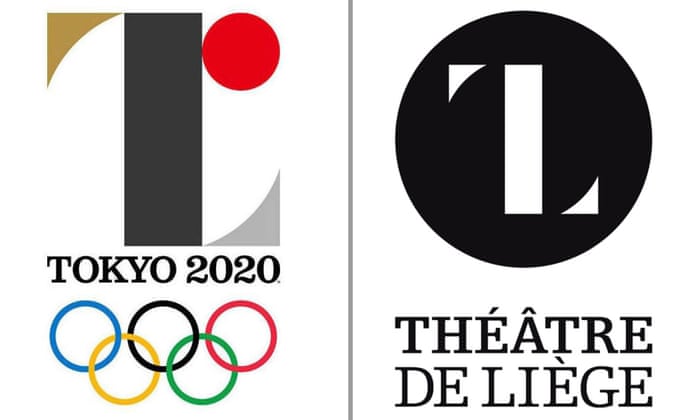
The first chosen one caused controversy in view of the fact the logo was extremely similar to Theatre de Liege’s logo designed by the Belgian designer Olivier Debie, so the committee promptly decided to re-open the contest.
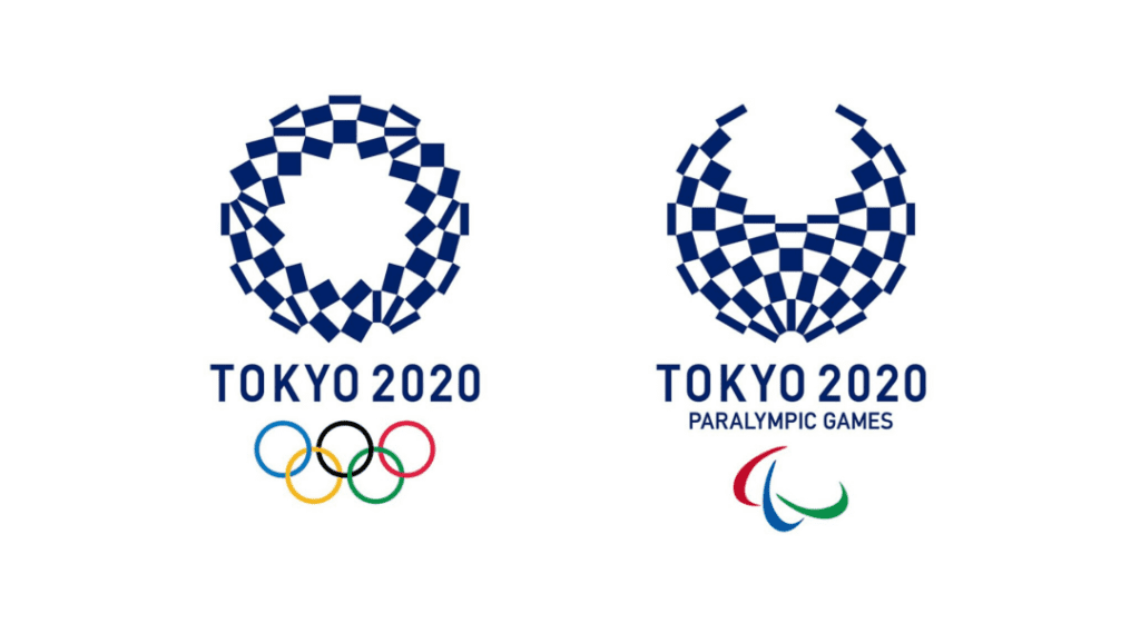
The selected winner of the second contest was Asao Tokolo’s project. The designer said “My mind has gone blank” when he received the news.
“I put a lot of time and effort into this design. I thought it was my own child.”He said.
The most enormous challenge was to face agile brands being transparent and collaborative.
The critical idea was to produce a brand that will be able to adequately communicate with everyone from everywhere for example. It could be vaguely Chinese, another resembles a tricolor that could be from either Italy or France, however, it should look Japanese.
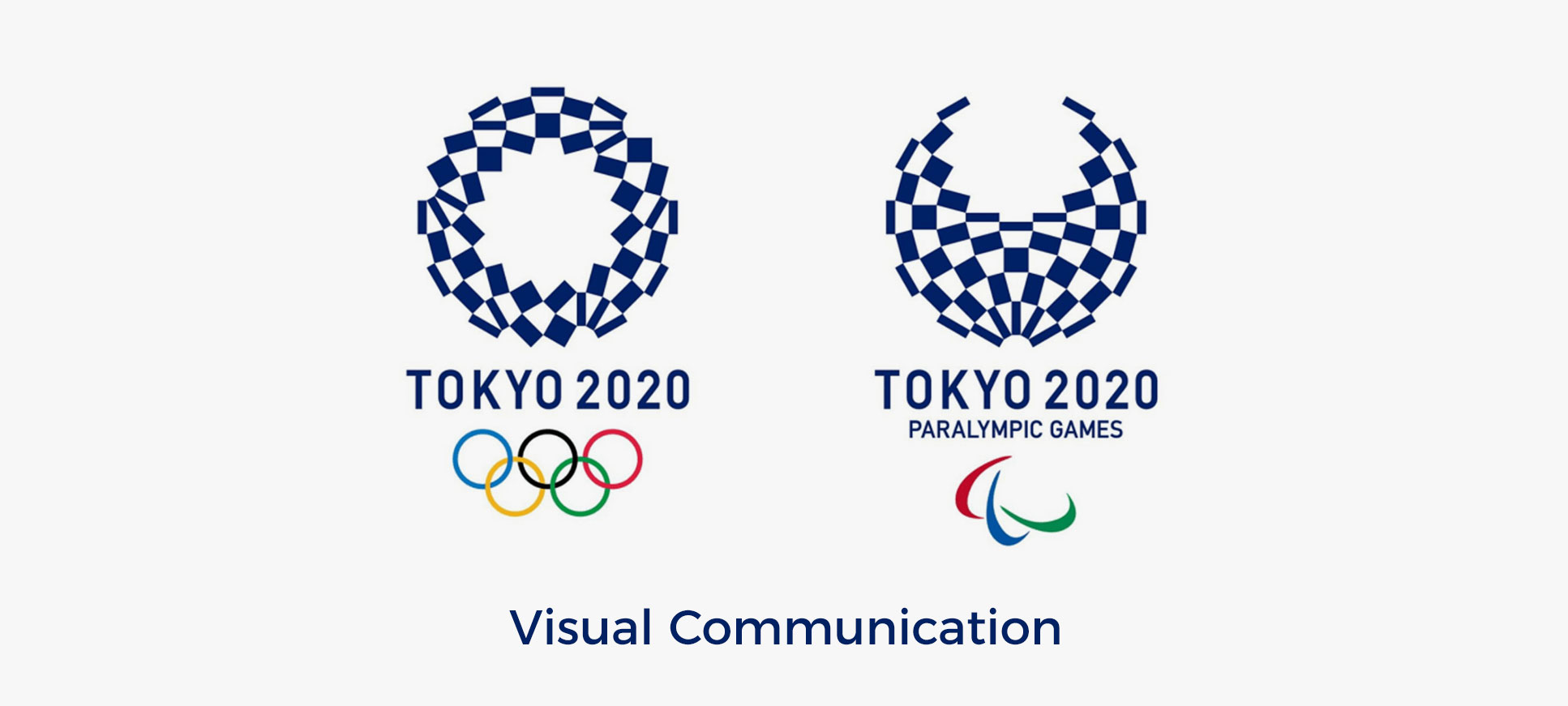
The emblem represents a cherequed, it means a complex pattern known as “Ichimatsu moyo” in the Edo period (1603-1867).
The color is indigo blue to express refined elegance and sophistication.
Rectangular shapes were added to demonstrate the fundamental concept of unity in diversity among the countries by promoting diversity as a platform to connect the world.
An Industrial sans serif typeface was applied which is similar to Din 1451 and Claredon, moreover, I can not ensure what font is it.
Pictograms
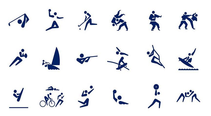
Pictograms were introduced in 1964 also in Tokyo to facilitate communication with the tourists and ever since this iconography has been used in all big sports events.
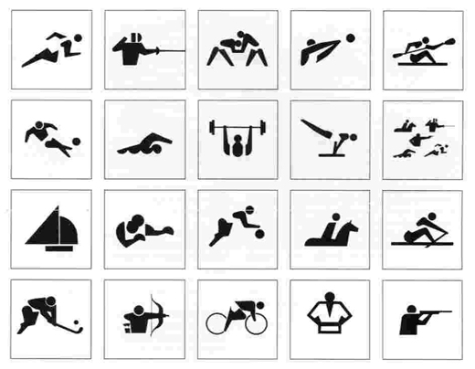
Innovation from harmony was the objective: by communicating the characteristics of each sport, including some art, highlighting the dynamic of every activity, it would naturally increase the experience for athletes and people watching on TV or online.
Mascots
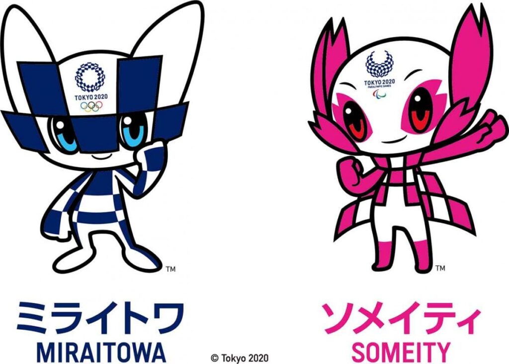
Miraitowa and Someity are the official mascots of Tokyo 2020.
Created By Ryo Taniaguchi, Miratowa means a combination of the words “future” and “eternity” in Japanese, according to the organizers the name was chosen to promote a future full of internal hope in the hearts of the people all over the world.
Someity is named after “someyoshino”, a type of cherry blossom.
The characters won a competition conducted by the Organizing Committee, 2042 projects were received, analyzed by some specialists, the vast majority voted for the brilliant Ryo Taniguchi’s idea.
The colors and shapes were inspired by the game’s logo, however, the key focus was to show the tradition and innovation, which are wonderful characteristics of Japanese people who respect the past and look to the future.
In addition, the mascots possess a deep sense of justice as well as they are extremely athletic and capable of teleportation.
Coming to an end, the Olympics are a global event to unite countries through sports and Japan is using a concept of modernity and tradition to host the Olympic competitions.
Worte by Rafael de Rezende Basso
