Helvetica was created in 1957 by Max Mudinger and Eduard Hoffman.
Hass, a small company from Switzerland, requested a rounded font, soft and with a big variety of weight, to be used in different visual communication in addition to match the modern design tendency.

The key reference to develop Helvetica was a font called Berthold Akzidenz Grotesk, a typeface without serif launched in 1898.
The name Helvetica is a tribute to Switzerland, and the initial idea was to call this project Helvetia which means Switzerland in Latin, however the designers thought that it would be very presumptuous to label their work by employing a country’s name, therefore they preferred to insert a “c.”
Years later it was bought by the German company D. Stempel AG by adding to this font more condensation and weight options.
In 1980 a modern version was released for the reason that Adrian Frutiger designed Univers by utilizing a numeric system to accurately adjust the font weight, spacing amongst others, therefore the owner realized that those adjustments were unnecessary.
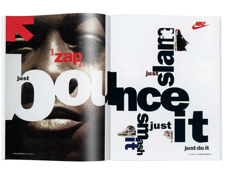
Neville Brody a notable designer and former director of “The face” magazine used Helvetica a lot during the 80’s, although now he says that this typeface is efficacious but boring in addition nowadays who applies it is entering in the “efficient club”, because it is very effortless to work with this font nevertheless it is less creative.
Niklaus Troxler, a Swiss graphic designer, supposes those professionals who use this typeface sincerely believe it is a soften method to work, according to him they do fail in the most practical manner.
Erik Spiekerman invariably says, “Appling Helvetica in your portfolio is like going to McDonalds instead of a more decent restaurant” solely on the grounds that they are omnipresent.
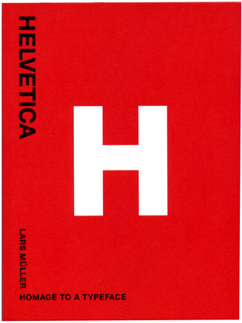
However, Lars Muller wrote a book called “Helvetica – Homage to a typeface” declared positively “Those hate ideas are a guarantee that a new Helvetica wave is coming up soon.”
Verdana and Georgia typefaces’ creator Matthew Carter presume “The most fascinating thing regarding this typeface is its horizontal terminals that we can note in some of its capital letters.”
We can say Arial is a poor version of Helvetica, created in 1982 by Robin Nicholas and Patricia Sanders, it was a job requested by IBM and posteriorly by Microsoft since those companies didn’t want to pay its copyrights.
In the final analysis we can correctly conclude that this font is dividing opinions for more than 50 years, so we can furthermore declare “Helvetica love or leave it.”
Wrote by Rafael de Rezende Basso
