Facebook changed its parent company name, now Instagram, WhatsApp, the Facebook app, and other projects will be under the “Meta” umbrella.
At this place, we will talk about the design behind the company’s name.
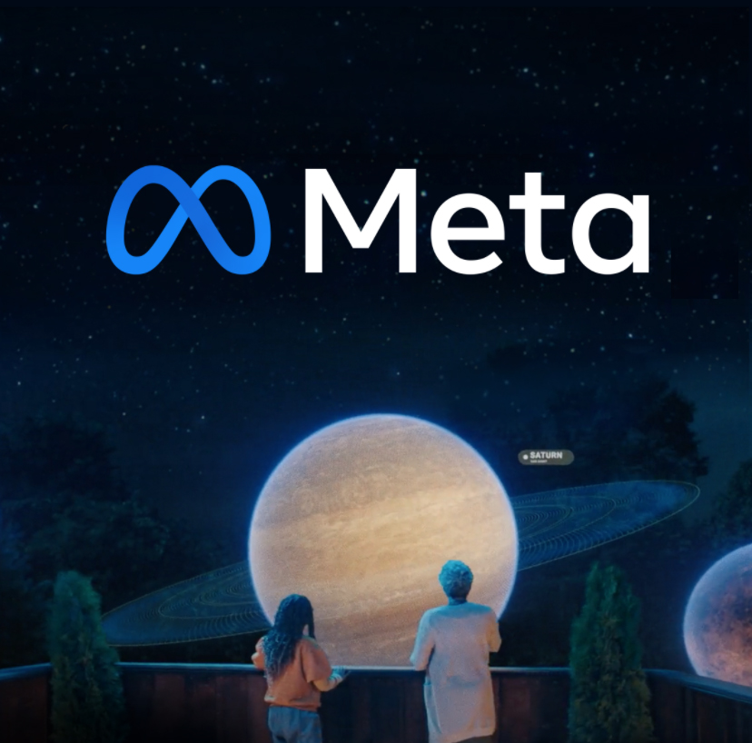
The brand system was developed by Meta’s employees from brand and product teams.
Designing for the future of social connection.
The enterprise says “it builds technology around people and their relationships because nothing beats being together.”
This ambitious project started in 2019 and came to public knowledge on October 28th, 2021.
According to Mark Zuckerberg, the previous brand was so tightly linked to one product that it can’t possibly represent everything that we are doing today.
The name
They chose “Meta ” because one of the possible meanings is beyond, so from now on with this new chapter the company will look beyond what digital connection makes possible today.
Also, in Portuguese “Meta” means goal, furthermore, we can properly say that this brand-new phase naturally comes with many different goals.
The symbol idea
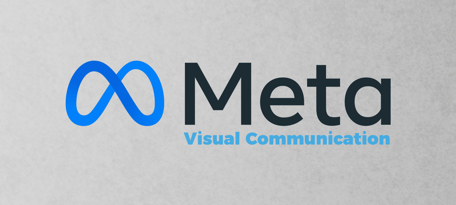
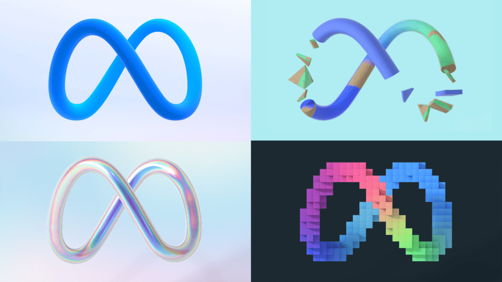
The primary concept was to create an iconic symbol to live in motion. The logo was created embracing their own Quest technology presenting a form of a continuous loop.
According to the company the logo could undoubtedly work between 2D and 3D, it equally represents an M from “Meta.”
It was generated to be dynamic and navigate in the metaverse, in addition to catching the creativity and imagination of a 3D world.
Wordmark
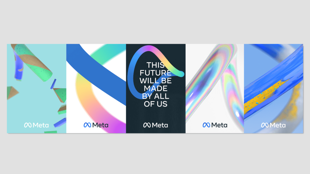
The idea of this design is to represent effectiveness together with elegant simplicity in an enormous range of applications, the typeface is the same introduced by the company in 2019.
Hey designers what do you think about this visual communication, tell us in the comments.
Wrote by: Rafael de Rezende Basso
