Graphic Design like any other field has concepts to be followed.
These principles are important mostly for those who are starting their careers, however, we should remember the below-mentioned concepts are not rules and could be ignored or you can do the opposite of what I will explain in the following lines.
Alignment
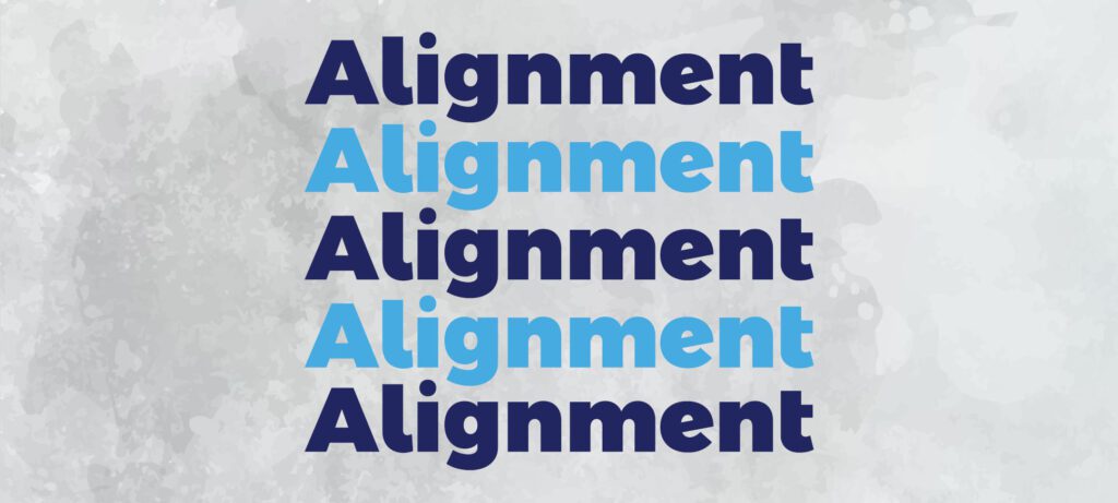
As everybody knows it exists four different kinds of alignment (left, right, centre and justify) the western world reading order always starts from the top left to the bottom right.
Try implementing the same alignment throughout the page, using two or more alignments in the same layout could be tough to read and understand.
We need to work with design tools wisely, so work utilizing guidelines every time to avoid any mistakes.

Although we are not only talking about texts, images utilize it in the same way, for example, normally the first information needs to be the logo its position should be on the left or at the top but centralized followed by the product or service that you are advertising in the centre and at last thing the price close to the bottom right.
Proximity

The items that make part of the same context must need to be close to each other, in reason of together they will create meaning.
It exists, because the lazy users don’t want to think a lot, by employing this idea it will be very easy to match the information, therefore, unite what is similar, in addition, take apart what is different.
Repetition
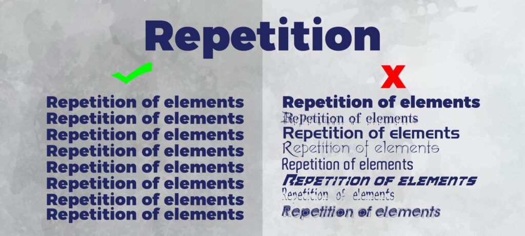
Just another example here:
Think about a catalogue that which each page has a different layout, it would be a mess, wouldn’t it?
Therefore this idea of repetition works to organize and establish a visual identity, no matter which media is your specific focus.
You have to develop a unique identity and intend as your guide until the end of the project.
Contrast

A text without contrast is completely unreadable, just imagine if this article was written in yellow instead of black, could you properly read it easily?
You can correctly apply contrast in a font by using bold or italic, to justly call your users’ attention.
Constantly try working with contrasting colours, furthermore not only for texts but also for images, if your product is red it does not make any sense to include a red background for instance.
Those fundamental principles are the basics of graphic design, as I mentioned in the past they are not rules but visual patterns developed to support people to comprehend a message.
You can check out David Carson’s work and see he rarely follows these guidelines, however, he is one of the most prominent contemporaneous designers and universally recognized for his “outlaw” portfolio.
Designers, do you use those key concepts?
Or are you trying to revolutionize the market?
Just say it to us in the comments.
Wrote by Rafael de Rezende Basso




Thanks for sharing the basics of graphic design layout with text and image.