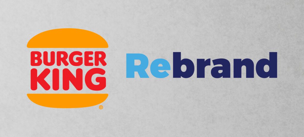
One of the most fashionable fast-food restaurants decided to change its logo and visual communication, in this post we will comprehend why the company modified it.
It is the first time in 20 years that the restaurant developed a new identity.
The project was headed by the agency Jones Knowles Ritchie (It also works with Budweiser amongst other big clients.)
Lisa Smith, executive creative director at Jones Knowles Ritchie says in an interview to the website Dezeen “We explored many different design territories, but kept coming back to the brand’s original iconic logo from 1969 and 1994 when Burger King looked at its best.”
The previous logo designed in 1999 has a blue rounded border and according to Smith withdrawing it was an successful attempt to reveal a no artificial looking.
The idea was to match the 70’s freedom with modern tendencies from the “digital era.”
The agency, in addition, designed a new unique typeface named “Flame” according to Raphael Abreu head of design it is “rounded, bold and yummy.”
Despite the logo itself, the new visual spreads the concept of having fun with food (On the contrary that my mom always said “Rafael don’t play with food… HAHAHA.”) as well as utilizing vibrant colors connected with simple shapes. An excellent example is the hula hoop onion rings around a finger.
Absolutely any rebrand nowadays must need to consider a link with the “smartphones and social media age” Burger King sorted it out by implementing a special favicon unifying the B and K with two buns, the aftermath depicts a stunning icon tremendously easy to identify does not matter the user’s device.
We can wisely conclude this project definitely presents us how to bridge the past and the present without missing values as well as attracting this new generation that was born holding a mobile phone.
Every time the designer has to confront the challenge to show up the client’s history and principles in addition produce a relationship with brand-new trends, by doing it we will ensure our client never will lose its identity as well as gaining potential sales.
Wrote by Rafael de Rezende Basso
